Top website designers explain the latest trends and inspiration for 2018
The top 5 trends in website design for 2018
In a forever moving industry, website designers are constantly having to battle between the latest updates in technology and ever-changing design trends and preferences. As the founder of a web design agency, I’ve found that the most notable trend is that customers are resistant to change.
Over the past 8 years, we’ve tirelessly battled with customers requesting outdated styling and trends. This often results in a website being out of date before we’ve even begun building! Why is this you may ask? It’s actually simple – the majority of businesses love to benchmark their competitors. The typical expected lifespan of a website for financial services business for example, is around 4 years. In reality these client expectations are wildly inaccurate. With rapidly changing technology and design trends, most websites will begin to show signs of age after around 18 months. This means that clients are taking inspiration from their competitors who often have out of date websites!
Website design trends to avoid (and never look back!)
To get inspiration for new web design trends, we must first look at the older ones to avoid.
1. The Animated Website Carousel (Slider)

A great example of a trend which has finally started to die out in 2018 are website carousels or animated banners. A recent study shows that virtually nobody tends to look past the first banner (nearly 95% of clicks are on the first!). The only time which you should perhaps consider an animated slideshow is for an eCommerce website. This is because engagement is typically slightly higher when savvy customers are hunting for a bargain. Informational/brochure websites should stick to a single banner which will also help with website load speeds.
2. Heavily tiered website structures
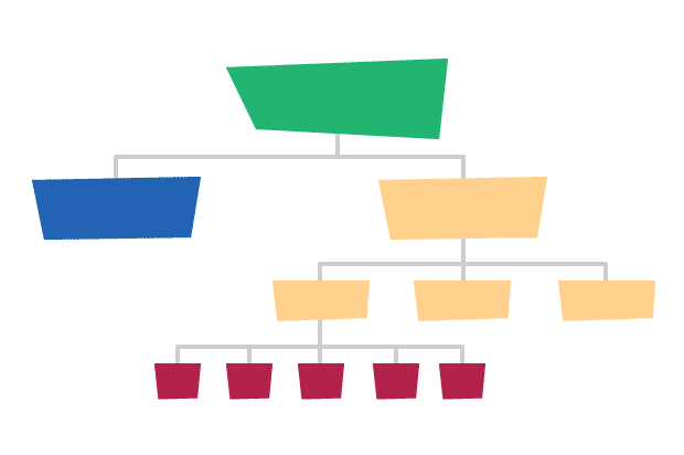 Established website designers who were building websites going back 8 years or so will remember the “good ol’ days” of simple brochure sites being dissected into 20+ pages. These would have a few hundred words per page on a sitemap which spans 4 levels deep. Visitors had to click endlessly through pages just to get basic information. Given the speed at which the patience-shattering 56kbps dial-up modems would connect at, it’s actually baffling that this was the trend. Nowadays, it’s imperative to ensure that when you’re designing the sitemap, less is more – without stuffing pages full of text!
3. Overuse of animations
There’s a fine balance between a nicely animated website which is considered engaging and the torrent of slide-ins, fades and parallax animations which I often see when visiting lower cost websites. Most average website visitors will be put off by this and will often be using budget laptops which means that the website will probably glitch and stagger. Remember – the more animations you have, the higher the probability it’s going to take too long to load and present issues for the average user. Don’t misinterpret this, animations when used subtly and with a ‘less is more’ approach can really help boost visitor conversion rates and increase engagement on the page – just don’t overdo it.
Web design trends to take inspiration from in 2018
As with many trends, there is often a cycle of trends which over time repeat and often morph. Most recently, this is apparent with the revival of shadows.
1. Flat design and the revival of shadows
Although flat design has been around for several years now, it’s still going strong. Perhaps one of the main reasons is because flat designs are typically vector images which can be highly compressed and outputted at SVGs. This ensures the images remain retina sharp, without impacting the load speeds.
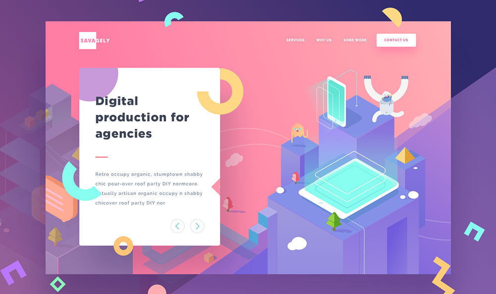
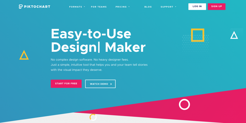
Shadows on boxes, shapes and images are being to see a comeback! Flat design is slowly morphing into 3D shapes with layers and depth and the latest trend is to sparingly use shadow effects to give flat designs a new lease of life. Check out the example below:
2. Subtle animations
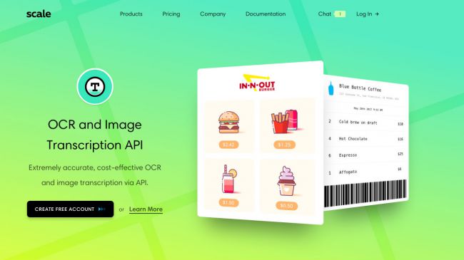
In 2018, animations really should be kept simple and subtle. Using hovers effects on buttons, subtle gradient changes and motions which do not distract the visitor are best. Parallax is still a great way to bring a page to live and has shown no signs of slowing throughout the year so far. It’s important to test your animations on a range of devices to ensure that the javascript/CSS isn’t causing the page to jitter. Take inspiration from the example above, which uses a typing effect to change the wording on the banner. It’s a fantastic way to draw a visitor’s eye and explain a product or service in just a few words.
3. Abstract shapes and adventurous colours
Perhaps another result of the focus on ensuring websites load quickly, vector shapes are a great way to make a website look modern without slowing the experience down. Small shapes can be created in Adobe Illustrator (or similar) and exported as SVGs. This allows the image to become responsive, without impacting the page size.
4. Use GIFs to express emotion
If you’re not sure what a GIF is, you’ve probably not used a mobile phone or social media before. They’re everywhere and they are here to stay. In an era where face to face interaction is in significant decline, it’s increasingly difficult to convey emotion through content and conversation. One of the key areas which website owners often struggle to convey in their content, is personality and emotion. The use of GIFs in blog articles, website copy and skyscraper articles is a fantastic way to get a quick laugh and use humour to engage with your audience.
5. Reading Progress Bar
A relatively new trend which is becoming increasingly popular is to show a simple progress bar at the top of a blog post or article. This automatically calculates how far through the article the reader is. It’s a nifty tool which can reduce bounce rates and increase time on page as visitors won’t be worried about how much more there is to read. If you’re looking for a free plugin, there’s a great one here – Reading Progress Bar for WordPress.
6. Google AMP
Perhaps one of the most important new trends of 2018, Google AMP is a relatively new method of displaying content almost instantly. The premise is simple – less is more and by enabling AMP on your website’s pages, mobile viewers will be able to click on your articles and visit your pages in a familiar, super fast environment. Google caches the pages locally to render them quicker. The only limitation is that AMP pages have basic layouts.